Histogram fitting Probability Density, Counts, Frequency
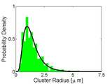
I modified histfit to output the fit results. I haven't reinvented the wheel here. I just took histfit and fixed it. The usage is the same. I also made it so that it automatically computes the interquartile range (http://en.wikipedia.org/wiki/Interquartile_range) for each fit. You can also specify the bins if you want. And now you can toggle between plot types: 'pdf', a curve with area 1; 'counts', number of counts; 'percent', put it in frequency.
If you have data that you want to fit to a histogram then use this function. Your data is a vector "data", then plot type. Chose from any of the viable options for the fit. And then the last input sets the plot type.
The output is the handles of the figure, the probability fit object with all the inherited properties, and xydata which is the x and y data to make the bar graph.
Here is an example.
[h,fitobject,xydata] = histfit2(xx,nbins,'lognormal','counts');
Use Freedman-Diaconis rule and plot as counts:
[h,fitobject,xydata] = histfit2(xx,[],'lognormal','percent');
It makes a pretty green bar graph. Have fun.
Cite As
Nathan Orloff (2024). Histogram fitting Probability Density, Counts, Frequency (https://www.mathworks.com/matlabcentral/fileexchange/45239-histogram-fitting-probability-density-counts-frequency), MATLAB Central File Exchange. Retrieved .
MATLAB Release Compatibility
Platform Compatibility
Windows macOS LinuxCategories
Tags
Community Treasure Hunt
Find the treasures in MATLAB Central and discover how the community can help you!
Start Hunting!Discover Live Editor
Create scripts with code, output, and formatted text in a single executable document.

